Gamut Graphics
(Go back to main Profiles page.)
August 16, 2006 (Revised March 7, 2017)
Two-dimensional plots work well for comparing working spaces or monitor spaces, but not very well for comparing either of them with printer spaces. This is because working and monitor spaces are shaped similarly, but printer spaces are shaped very differently in side view, with far fewer lighter colors and often a lot more of some darker colors. It is therefore routine for a working space to contain a lot of colors that couldn't possibly be printed by any printer, now or in the future, and for a printer's gamut to contain fewer, but still a lot of colors that don't fit into the working space (unless it's a huge one). It's usually the printer's darker greenish cyans that are most likely to protrude beyond the bounds of a working space. This particular range of colors tends to be of little value for photography though.
Still, don't assume that just because some of a printer's gamut is outside your working space that you can't print those colors. If you have a set of chroma variants for your working space, they will allow you to print such colors whenever you are using a plus variant that is large enough to encompass them. The variants run up to a maximum of 100% larger in radius in Lab space than the master space for which they were made, if you're comparing where essentially all of the relevant colors fall in D50 Lab space, but ignoring the effects of the outer boundary limitations of Lab, which limit the expansion of what are nearly all imaginary colors, mathematical representations of something which cannot exist.
Two sample images shown with a range of chroma variants applied can be downloaded on the Sample Effects page.
Section I : 3D movies
Section II : Gamut bar graphs
Section III : Individual plots
Section IV : Comparison plots of two or more together
SECTION I
It may be necessary to hold down your Option or Alt key while clicking the links to save them to your hard drive. View them with QuickTime Player.
3D movie #1: "UltraChrome K3 vs sRGB Lab.mov.zip" (560 KB download)
This 3D model is a classic comparison of a monitor-like gamut with a very large printer gamut. Many important things can be learned from this model. Remember though that the monitor space's white is the equivalent of a perfect sheet of paper, an imaginary 100% diffuse reflector, and the monitor's black is similarly shown as being a perfect black, another unreal condition.
1) Note how the tip of the printer gamut, the paper white, is a certain distance below the monitor white (Lab 100, 0, 0). This distance tells you how bright the spectrophotometer which was used to make the printer profile thought the paper was, in L* units, with its UV-filter in place to avoid measuring fluorescence, which would skew the result.
2) Note the huge light green gamut of the monitor and the huge dark cyan-green gamut of the printer, each outside the other space's gamut.
3) Notice how many printer yellows the monitor can't show.
4) Notice that the monitor's purest red is stronger than the printer's.
5) But also notice the gigantic gamut of the monitor in the blue region, compared with the printer's. This is where printers always come up the most short compared with display gamuts and with RGB working space gamuts. Very strong blue values (e.g. anything approaching 0, 0, 255) in RGB working spaces of nearly any type are essentially forbidden territory for printing! If you put highly saturated blue values into your images, you're apt to only cause serious gamut mapping problems for your printer profile to handle and the result is apt to be purple-shifted blues that are very weak compared to the source color anyway. Perhaps the most common way this used to happen is when photographers used Velvia, exposed it to medium-dark blue colors with very cool illumination without a UV(0) filter over the lens, let alone the proper light balancing filter, and then increased the overall saturation even more during the image rendering process. The net result being wildly exaggerated blues that wind up making a distorted mess out of skies and especially skies reflected in water.
6) This one model, more than any other on my site, illustrates the difficulty faced by color management systems, and also shows why 2D projections don't tell the story of printer vs. RGB space gamut mapping problems well at all.
3D movie #2: "UltraChrome K3 vs DCam 3.mov.zip" (660 KB download)
This 3D model shows how very large DCam 3 is, but that even so it still doesn't encompass all of those darker green-cyans of this printing system's very large gamut — not that this is much of a problem, given that those colors are very unlikely to appear in your images. This DCam gamut is designed to encompass nearly all of the colors that you will ever find in the world around you, and with a little help from some of its chroma variants it can handily contain even those darker green-cyan printer colors and a lot more if necessary. Unlike movie #1, this 3D model shows a Yxy space projection instead of a Lab space projection. Each model has its advantages. Lab is more perceptually uniform, but it's not large enough to show the larger spaces without chopping them off as they hit the walls of Lab.
3D movie #3: "UltraChrome K3 vs LightJet Lab.mov.zip" (436 KB download)
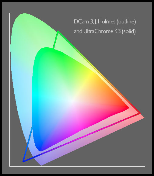
This 3D model compares the gamut of EPSON's most recent professional inkset as of 2006, UltraChrome K3, on an early photographic-style, "RC" paper, Premium Luster Photo Paper (250), with a ~2005 example of LightJet output on Fuji's Crystal Archive chromogenic paper. The UltraChrome gamut is the larger of the two. These two printing systems were dominant a decade ago and remain of great relevance to photographers in 2017. The LightJet result is representative of similar systems such as the Chromira and Lambda when they are using this same paper. This EPSON pigmented ink gamut is larger even than most dye-based inkjet gamuts, which is a wonderful development. It was the state of the art for color printing at the time, now surpassed by EPSON's most recent inksets such as the UltraChrome HD set that I use now, which nearly triples the fade resistance of the yellow pigment and much improves the Dmax of the matte black ink, while retaining very nearly the same gamut as the earlier inksets.
Dye gamuts tend to be superior in the darker colors and pigments tend to be better in the lighter colors, but the K3 gamut is so big that it does rather well even in the darker colors, though still not quite as well there as the Light Jet. In the lighter colors, the K3 gamut has a huge advantage, except in the medium to dark, royal blues to magentas, where this chromogenic gamut is generally superior. The Dmax of each system is variable, depending on how it is used and each can run between fairly good (say 2.20) to very good (over 2.40) on glossy (PK ink) papers. Most prints made with the K3 inkset are rated between three and five times longer-lasting on display than those made with Fuji's relatively long-lasting chromogenic paper, when the inkjet prints are shown behind UV-filtering glass or plex. Ratings for the latest inkset, the UC HD, are generally double that, but in my opinion they deserve more like a triple rating, because of the details of how they fade on display, which are just plain excellent. See http://www.wilhelm-research.com and http://www.aardenburg-imaging.com/light-fade-test-results/.
SECTION II
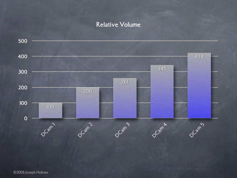
Relative Gamut Volumes, DCam Series
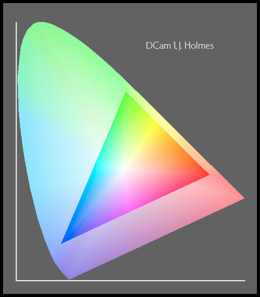
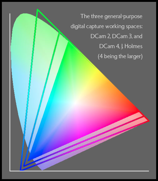
This bar graph shows the relative Lab volumes of my new DCam series of RGB working spaces. Note that the big jump at the bottom end is due to the special-purpose nature of DCam 1, J. Holmes. It is intended only for use with images of very low gamut demands as a way to greatly minimize quantization error and should only be used as an adjunct to one of the general-purpose spaces, DCam 2, DCam 3 and/or DCam 4.
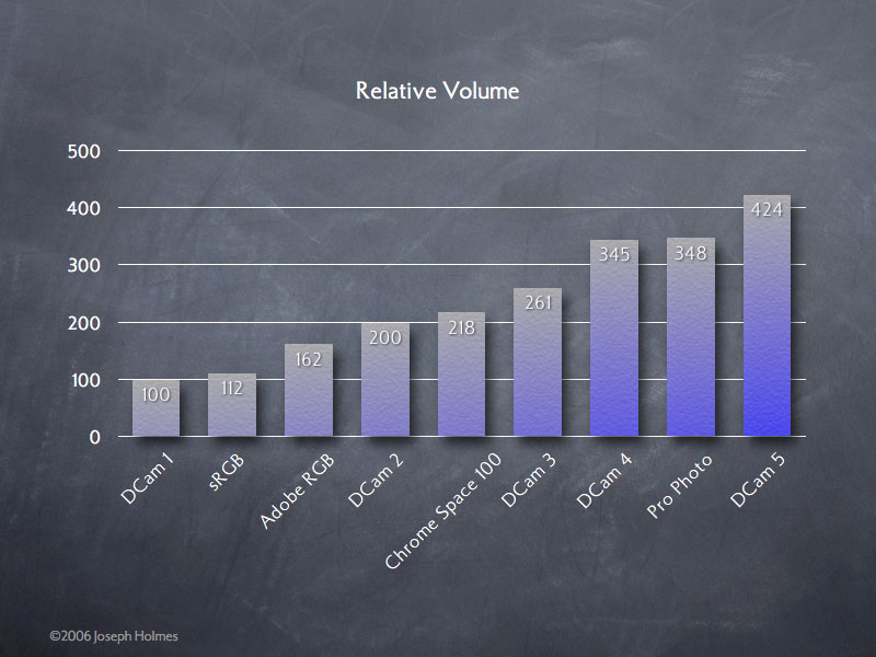
Relative Gamut Volumes, All Nine Spaces
This bar graph shows the relative volumes of every space for which I have a chroma variant set (eight bars for nine spaces, as Ekta Space matches the gamut volume of Chrome Space 100).
SECTION III
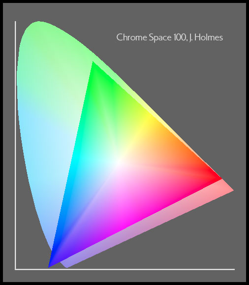
My original working space, which was very carefully crafted to beautifully fit around the real-world colors from transparencies, as mapped by a proper scanner profile and which is the basis for Ekta Space PS 5 as well (same gamut, different tone curve). Recently upgraded to a beautiful 1,024-point tone curve and re-named from Ektachrome Space, but still backward compatible with Ektachrome Space, not to be confused with Ekta Space!
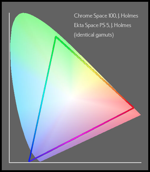
Chrome Space 100 and Ekta Space PS 5
(two identical gamuts appear as one)
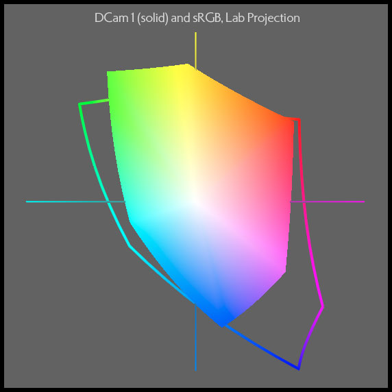
This is a special-purpose space only, for use as an adjunct to the general-purpose DCam spaces, DCam 2, 3 and/or 4. DCam 1 will safely contain most ordinary colors, except when moderately saturated colors are very light or very dark. Forget about fitting the lighter colors of most flowers into this space. Its purpose is to make it easy to greatly minimize quantization error with files that have fairly neutral highlights and shadows, including the great many images of subtle coloration that photographers make. For the ultimate in quality for such images, convert directly into DCam 1 from the camera profile at high bit depth.
DCam 2 is a superior alternative to Adobe RGB with far better efficiency at encompassing real-world colors, including subject and printer colors both. It's an ideal choice for a general-purpose digital camera capture RGB working space when the photographer tends to avoid very saturated subject colors and wants to optimize quantization efficiency. I use DCam 2 the most often when making the initial conversion from raw capture in the camera space/profile into an RGB working space. I use both DCam 3 and DCam 1 somewhat less often, and depending on the gamut of the subject matter as edited in the raw conversion software.
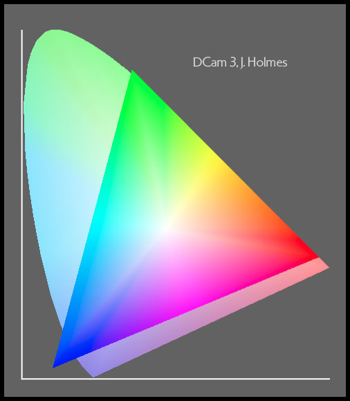
Fits like a glove around the entire Munsell color set and a broad range of real-world subject colors, as well as fitting very nicely around the colors that printers can print, excepting a modest range of darker cyan-greens from the larger gamuts which are unlikely to ever be needed to show colors in your images. Even those cyan-green colors of the UltraChrome K3 gamut which are outside the DCam 3 gamut are encapsulated by the +25 or +31 variant of DCam 3. It is the most ideal choice for a general-purpose, robust, large DCam capture space. It will contain such brilliant colors as neon red and virtually one hundred percent of flower and fabric colors. If you want just one space for new work which covers the world well, this would be my recommendation.
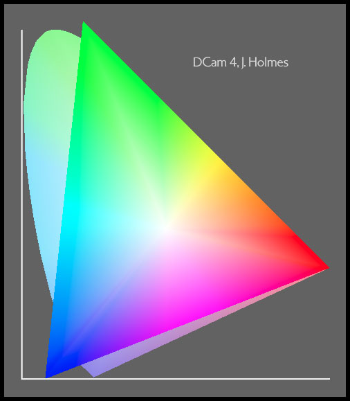
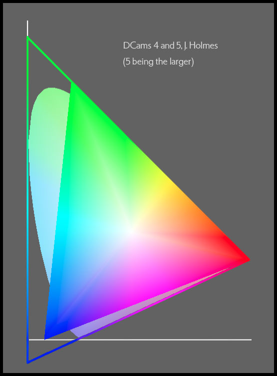
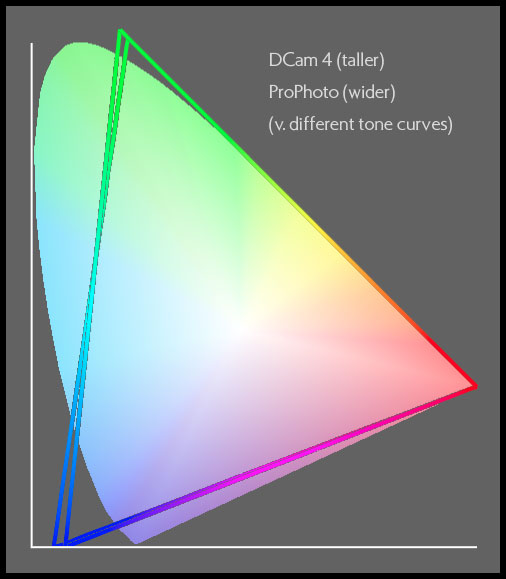
Although similar to it, I believe DCam 4 to be a slightly better conceived huge gamut space than ProPhoto RGB, with a little more gamut in the royal blues where it is more likely to be needed some day and a little less gamut in the darker cyans, where it is unlikely to be needed. Perhaps more important is the tone curve advantage of my space, which will most likely only matter if the data are ever in 8-bit form, however. The two spaces have identical light cyan gamuts. Recommended when a single space is desired for all captures and the data are all 16-bit from the start, including 14- or especially 16-bit in-camera AtoD conversions, or when a little more headroom is needed in the pure magenta to red to yellow to green to pure cyan range. Headroom is not increased in the pure cyan to blue to pure magenta range compared with DCam 3. Note that these added colors will inevitably remain outside the gamuts of all printers, most likely forever. Adds various highly saturated color ranges to DCam 3 but still cannot contain all the colors we can see. Shares the same perceptually linear tone curve as my other four DCam spaces for optimal data protection during conversion to well-behaved printers.
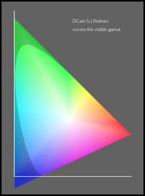
Ever wanted a space that didn't mess around and just covered the entire human visual gamut? If you don't worry about quantization error hurting your data because you keep it in 16-bit form up until after you've converted into printer space, then using DCam 4 or DCam 5 shouldn't hurt your data more than a very little bit. DCam 5 offers the most headroom of any available working space, as well as the most horizontal gamut. Though ICC workflows restrict usable colors to the limits of conventionally encoded Lab space, leaving out some of the most brilliant greens and yellows and a tiny sliver of intense blue, having a giant space that covers the entire CIE 2 degree Chromaticity Diagram does give you even more room to move without clipping in several parts of the color space than DCam 4 or Pro Photo, most notably in many bright colors of modest saturation, including hues from mid-magenta through red, yellow, green and mid-cyan. Potentially useful as a scientific tool for image processing.
You might ask yourself, what does the gamut of 1950's color television have to do with the gamut of subject colors delivered by today's digital camera systems? Adobe RGB is famously said to have been created accidentally by combining two existing television gamuts into one working space: the red and blue of PAL/SECAM and the green of NTSC (1953), from which it is indeed made. For an accident, it performs well, but its match to real-world colors captured by digital cameras and processed in the camera or with RAW converter applications is far from optimal and its gamut is too small to consider it an accommodating general-purpose imaging space. It's tone curve is a gamma curve which gets much too flat near black for a good match to printing systems, though it's fine as a match to display systems, and its white point is D65, making it, I think, pointlessly different from the PCS white point of D50 and causing what could be a slight risk of white point adaptation error. I think it's obvious that it should be replaced as a standard space for digital capture. Indeed, this ill-conceived space has already started to do serious harm to the high-gamut displays of the world, by pushing display makers, who often make an effort to match it, to build displays incorrectly. The poor choice of a green primary is the greatest problem, with peak wavelengths of ~525nm instead of something more appropriate for both gamut and the minimizing of metameric failure such as ~540 to 550nm. Another way to picture this is that the green is much too far to the left in a Yxy plot, causing the needless omission of many warm colors and the needless inclusion of many cyans.
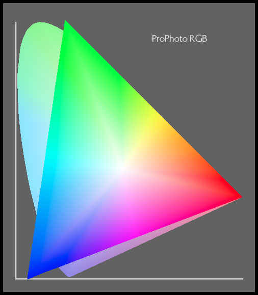
ProPhoto, from Kodak's color scientists, is a well-conceived space for storing a very large range of colors. My principle complaint with it is that is uses a gamma tone curve, and that all gamma curves are less than ideal for encoding data because they become too flat near black and fail to match perceptual linearity very well. It's unlikely this will hurt you noticeably in a 16-bit workflow, however.
SECTION IV
My trio of new, general-purpose RGB working spaces for digitally captured images.
DCam 2, DCam 3, DCam 4 and sRGB
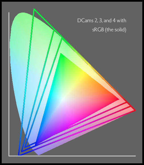
A comparison with sRGB, a monitor space, showing how and how much the actual incidence of colors in the world (as captured by digital camera systems) differs from the range of colors that happens to be displayable on a monitor.
DCam 2, DCam 3 and DCam 4, Lab Projection
The Lab projection is a closer approximation of human perception. Note how the spaces are constrained by the square boundaries of Lab.
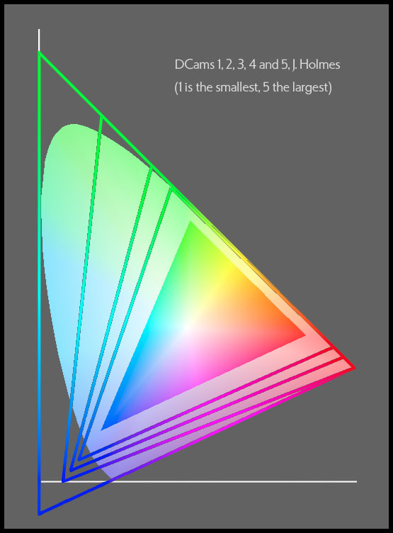
Compare this with the Lab projection of the same, below. Note that neither one shows the progression accurately. Lab would do so much better if it didn't truncate the most brilliant colors where they hit the square walls of the Lab space. The progression of the five spaces is more regular than it seems despite being deliberately distorted as was appropriate for several reasons. As a group, these spaces respect the ranges of important, real-world colors, including subject and printer colors both (but not transparency colors), better (more efficiently) than any spaces I know.
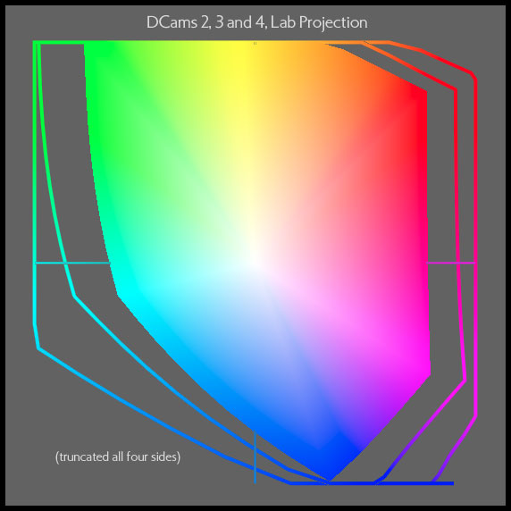
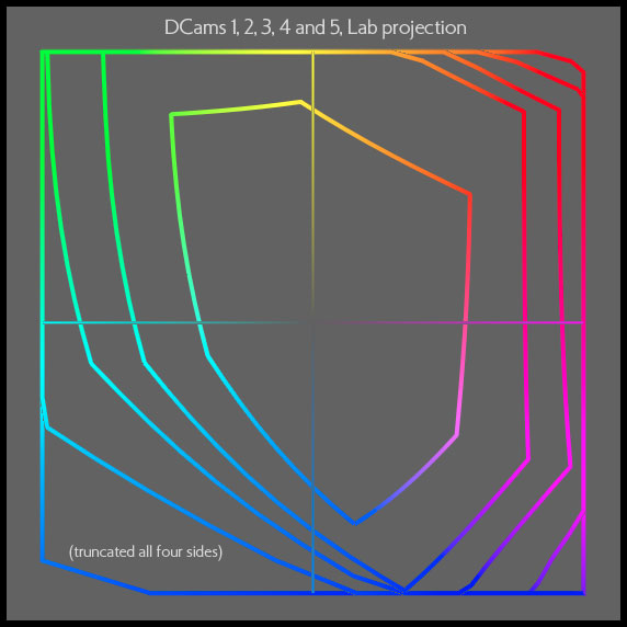
All Five DCam Spaces, Lab Projection
When plotted in Lab space, the plotting tool vignettes the gamut boundary to the edges of conventional Lab space, and we can plainly see where the gamuts have become flat on all four sides of this plot, affecting the outer three gamuts on up to four sides. The plot is nevertheless useful as another way to get a quantitative sense of the color gamuts of the five spaces.
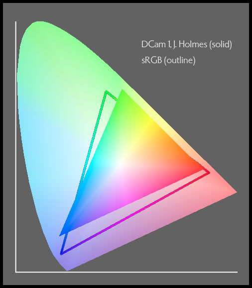
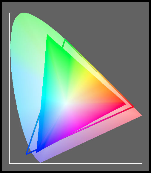
DCam 1 vs. sRGB, Lab Projection
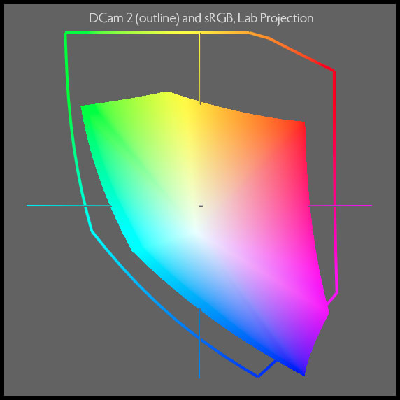
DCam 2 vs. sRGB, Lab Projection
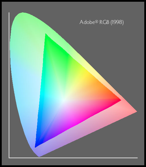
sRGB and Adobe RGB (1998) use a very different green, but the exact same red and blue coordinates. Although Adobe RGB is substantially better for avoiding clipping than just using a monitor space, DCam 2 is a far more efficient way to provide a robust gamut and is carefully balanced to the colors in digitally captured images with relatively minimally increased volume.
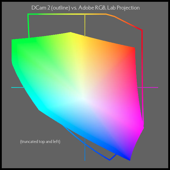
DCam 2 vs. Adobe, Lab Projection
This Lab projection is more perceptually accurate and shows the very large differences between my DCam 2 and the ubiquitous Adobe RGB better than the Yxy plot. I believe the exact range of colors covered by DCam 2 is an ideal balance of inclusion and exclusion, given the actual colors that photographers capture with digital cameras and their RAW processing, at this gamut volume (large but conservatively so).
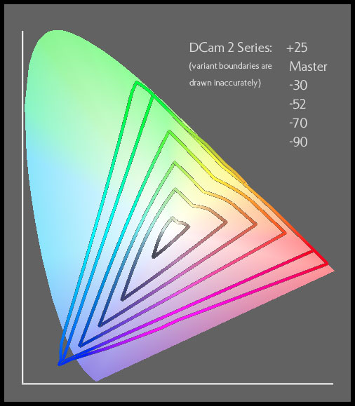
This 2D plot, the only one of its type on my site, approximately illustrates the way the chroma variants work. Each is essentially a progressively fatter or skinnier version of the original working space. Shown are the +25 variant for DCam 2, DCam 2 itself, and the -30, -52, -70, and -90 variants of DCam 2. The actual boundaries are shown incorrectly enough in the drawing, so that each is not shown as neatly concentric around the other as it should be shown. Rest assured however that all of my variants do behave properly in all hues, progressively moving colors inward or outward precisely as indicated by their file name.
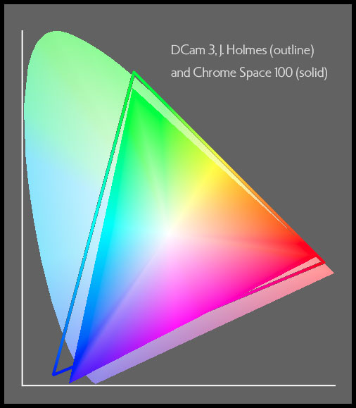
The shift from Chrome Space (for transparency film gamut) to DCam 3 (for subject matter gamut) is readily visible in this comparison.
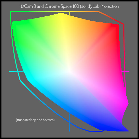
DCam 3 vs. Chrome Space 100, Lab Projection
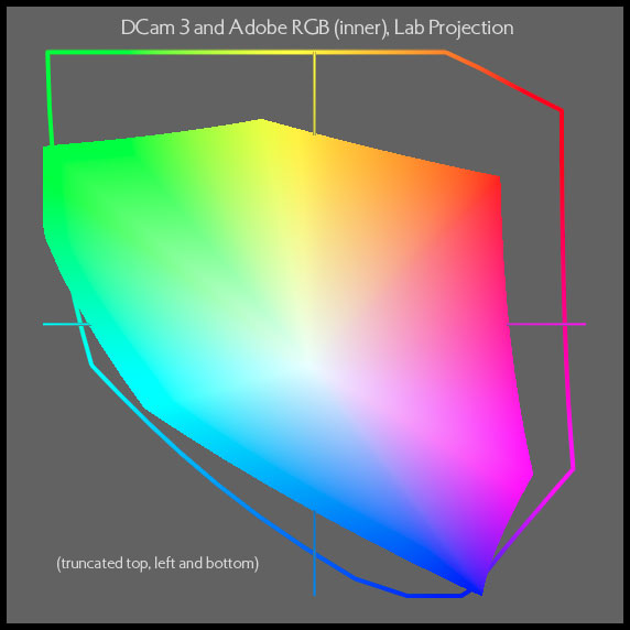
And here is a Lab projection which shows a more perceptually uniform view, but which suffers from vignetting mainly at the top of DCam 3 (Lab space is a limiting factor in the use of all ICC profiles today).
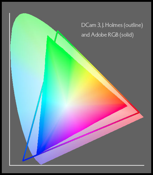
DCam 3 is also very carefully designed to accommodate an ideally balanced range of processed color from digital captures, but is more accommodating with its larger gamut than DCam 2.
DCam 3 vs. Adobe, Lab Projection
This Lab projection is more perceptually accurate and shows the large conceptual differences between my DCam series (here the DCam 3) and this space which is so commonly used in digital imaging, including digital camera capture. Needless to say, my etensive research and experience indicate a wide gulf between the requirements of ideal digital capture and the currently dominant sRGB and Adobe RGB working spaces.
See Movie #2 above. This 2D view is provided to help you visualize the differences between 2D and 3D renderings.
Though DCam 4 looks a little smaller than ProPhoto, if anything it will hold a few more relevant colors than ProPhoto, and uses a better tone curve. Both spaces are very good general purpose, huge gamut spaces, however. My spaces (except for Ekta Space PS 5) all share my perceptually uniform tone curve for optimal output mapping.